Knowledge Center Technical Analysis
Technical Chart
Types of Technical Charts:
Three primary chart types in technical analysis:
-
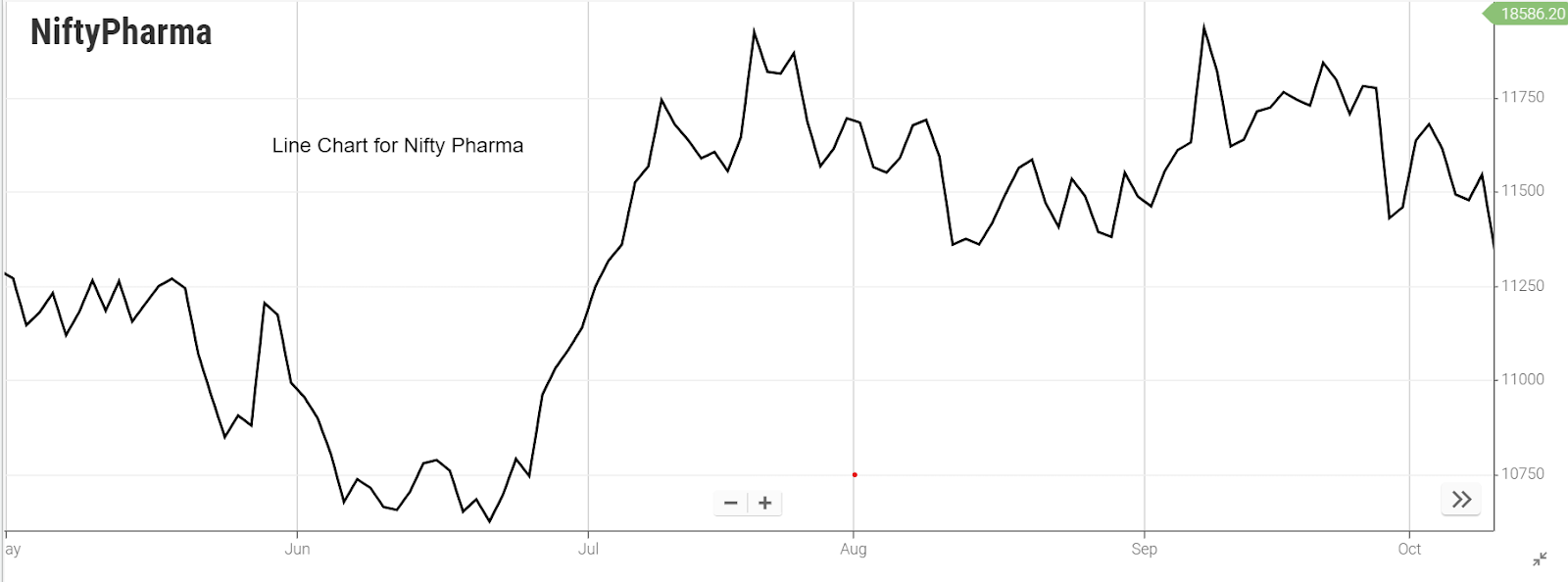
Line Chart
-
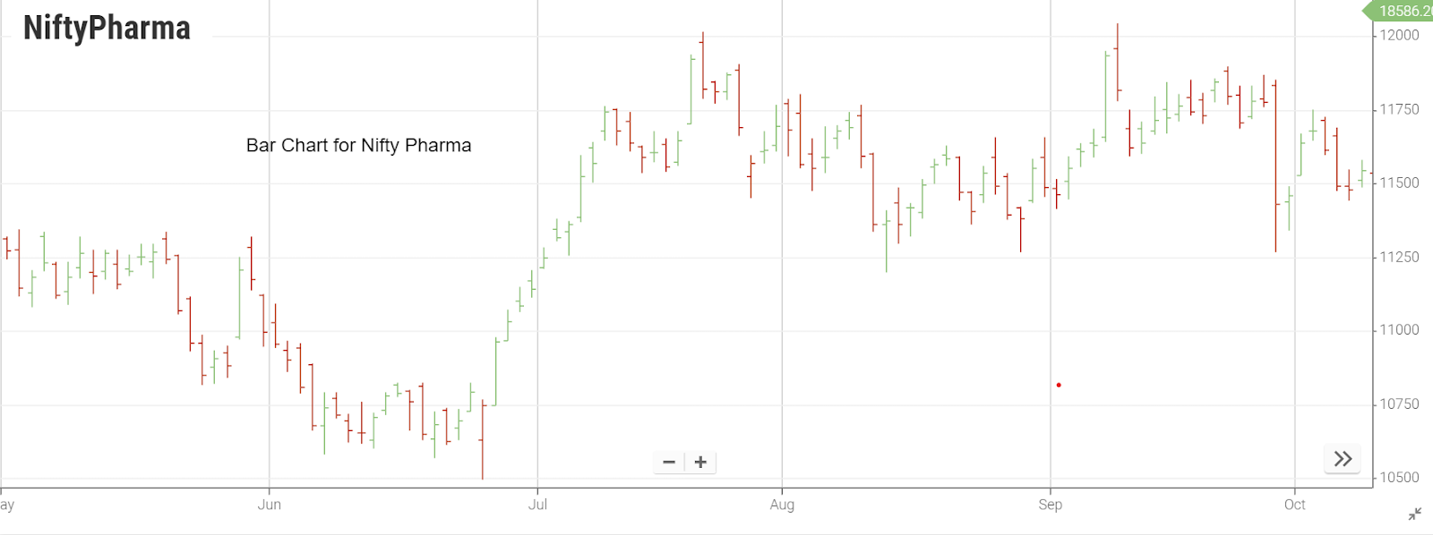
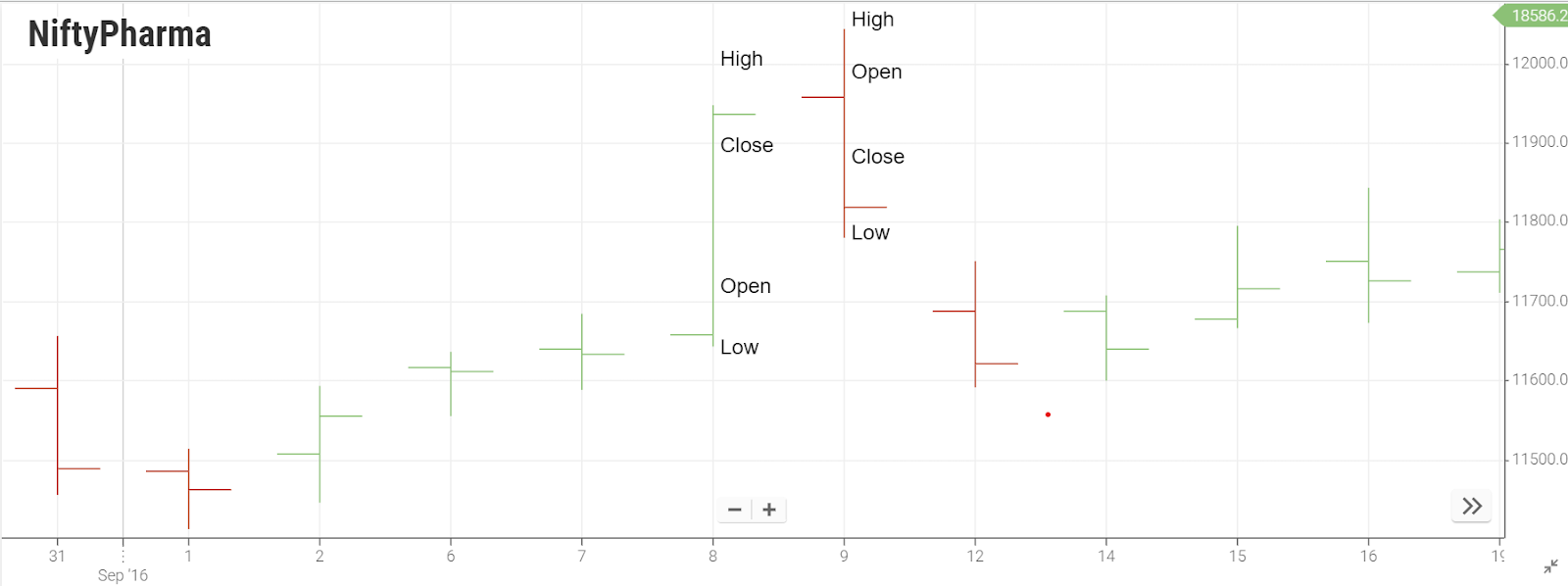
Bar Chart
-
Candlestick Chart
Line Chart
A line chart, the fundamental tool in technical analysis, provides a straightforward representation of price movements by connecting closing prices over various time frames.
1. Basic Construction:
-
The line chart involves linking closing prices with a single line from left to right.
-
It exclusively considers the closing price, omitting other data points like opening, high, or low prices.
2. Time Frame Considerations:
-
Different time frames dictate the closing prices utilized in the chart.
-
For instance, on a 1-minute line chart, the closing price after each minute is considered.
-
On longer time frames like a daily chart, the closing price at the end of each day is utilized.
3. Positives of Line Chart:
-
Straightforward and uncomplicated, making it beginner-friendly.
-
Effective for comparing the movement of multiple stocks on the same chart.
4. Negatives of Line Chart:
-
Limited information as it only includes closing prices.
-
Excludes opening, high, and low prices, providing a less detailed view.
5. Application and Preference:
-
Line charts are preferred for a high-level glance at a market or to understand the general trend of a security.
-
Often used in presentations and reports to convey a general view of historical and current price direction.
6. Comparisons with Other Charts:
-
While line charts are great for a general overview, bar and candlestick charts offer more granular insights into price movements.
-
Line charts are particularly favored by traders who prioritize the importance of closing prices over other data points within a given period.
7. Constructing a Line Chart:
-
Involves plotting closing stock prices on a graph with the vertical axis representing stock prices and the horizontal axis denoting time.
-
Each plotted point corresponds to the closing price on a specific date.
-
Connecting these points with a line creates the line chart, offering a visual representation of the price trend over time.
Bar Chart
A bar chart, a key tool in technical analysis, stands as a more informative counterpart to the simplicity of a line chart. Here's an in-depth exploration of the characteristics and advantages of bar charts:
1. Basic Construction:
In contrast to a dot on a line chart, a bar chart employs vertical lines with two horizontal lines protruding on either side, offering a wealth of information.
The top end signifies the highest price during a trading day, while the bottom point indicates the lowest. The left horizontal line denotes the opening price, and the right one signifies the closing price.
2. Advantages over Line Charts:
Bar charts transcend line charts by not only depicting prices but also reflecting price volatility.
The length of the vertical line indicates the difference between opening and closing prices, providing insights into volatility. Higher volatility implies greater risk, crucial information for investors assessing comfort levels with frequent and sharp price changes.
3. OHLC Representation:
Also known as open-high-low-close (OHLC) charts, bar charts consist of vertical lines representing the price range during a specific time frame.
Each vertical bar encapsulates open, high, low, and closed prices, with the opening and closing prices denoted by horizontal lines on either side.
Rising periods are often represented in black or green while falling periods are depicted in red.
4. Detailed Price Representation:
The highest point of the bar signifies the highest traded price, while the lowest point denotes the lowest.
Short horizontal lines on the left and right represent the opening and closing prices, respectively.
Despite appearing busier than line charts, bar charts provide a clearer understanding of the high and low prices relative to the open or close, making them valuable for analyzing longer-term price movements.
5. Long-Term Analysis:
Bar charts can span different time frames, such as daily, weekly, or monthly, with each bar representing the price action for the respective period.
They offer a comprehensive view of where high and low prices stand relative to the open or close, aiding in the analysis of longer-term price trends.
In summary, bar charts are powerful tools that not only encapsulate price information but also offer insights into volatility, making them indispensable for traders seeking a nuanced understanding of market dynamics.
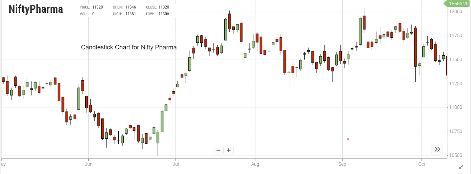
Candlestick Chart
Candlestick charts, renowned as the most popular charting technique globally, offer a nuanced depiction of market dynamics through four critical price points – Open, High, Low, and Close (OHLC). This comprehensive charting method is detailed below:
1. Fundamental Composition:
-
Each candlestick encapsulates four vital price points – Open, High, Low, and Close, fostering a detailed understanding of market movements.
-
The body of the candlestick is colored either green or red, representing upward or downward price movements.
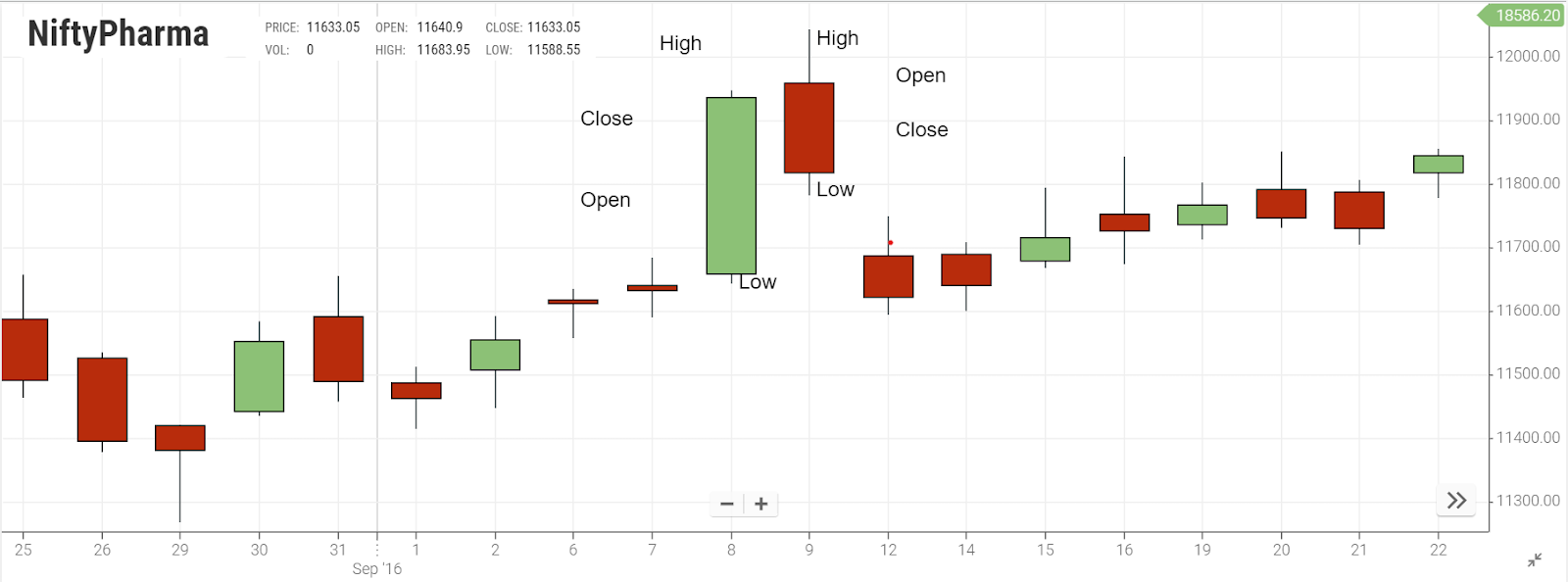
2. Bullish and Bearish Signals:
-
A green candle denotes an upward price movement, where the closing point surpasses the opening point.
-
Conversely, a red candle indicates a downward movement, with the closing price below the opening price.
-
The highest point on the candlestick represents the day's highest trading price, while the lowest point signifies the lowest trading price.
3. OHLC Representation and Volatility Insight:
-
Candlestick charts, akin to bar charts, display the open, high, low, and close prices for a given period.
-
The difference lies in the color of the "real body" – white or green for a close higher than the open and black or red for the opposite.
-
The upper and lower lines, known as shadows or wicks, convey the highest and lowest prices during the timeframe.
4. Candlestick Patterns and Trend Reversals:
-
Candlestick charts provide valuable insights into bullish, bearish, or neutral sentiments based on the relationship between open and close.
-
Candlestick patterns, forming over short periods, can indicate trend reversals, aiding investors in timely buy or sell decisions.
5. Variations and Appearance:
-
Candlestick charts come in two shades – light and dark – representing days where the opening price was greater or lower than the closing price.
-
The appearance of candles on a candlestick chart reflects volatility, with lighter shades signifying less volatility and darker shades indicating higher volatility.
6. Comparison with Bar Charts:
-
Candlestick charts surpass bar charts by offering information about volatility throughout the considered period, not just within each trading day.
-
The distinct colors and shapes of candlestick patterns provide a more visually intuitive representation of market trends.
In conclusion, candlestick charts serve as a powerful tool for traders, providing not only a visual representation of price movements but also insights into market sentiment and volatility, making them indispensable for informed decision-making.
Frequently Asked Questions
-
What is a Bar Chart in Technical Analysis?
A visual representation of price movements is crucial for detailed market analysis.
-
Can you explain the Railway Track Candlestick Pattern?
The railway tracks pattern in Forex trading is a price action strategy that involves analyzing two candlesticks with similar lengths. One candlestick must be bullish, indicating upward price movement, while the other must be bearish, suggesting downward movement. This strategy relies on identifying the symmetry between the lengths of the two candlesticks to make informed trading decisions.
-
What sets apart a Candlestick Chart from a Bar Chart?
While both provide information, candlestick charts emphasize market volatility and sentiment.
-
Are there Different Types of Money Charts?
Bar charts, candlestick charts, line charts, and point and figure charts are among the various types of stock charts that traders can utilize. Almost all stock charts provide the flexibility to switch between different chart styles and overlay various technical indicators. This versatility allows traders to adapt their charting approach based on their preferences and analysis requirements, enhancing the effectiveness of their technical analysis in the stock market.
-
What's the Significance of Types of Technical Analysis Charts?
Different chart formats provide valuable insights into market trends and patterns.
-
How does a Candlestick Chart Differ from a Bar Chart?
Candlestick charts excel in revealing market sentiment and volatility compared to bar charts.
-
Can you explain the Dash Candlestick Chart?
It's a specialized candlestick chart variant offering unique insights into price movements.
-
Is there a Crude Oil Candlestick Chart?
Yes, a specific chart tracking price fluctuations in crude oil markets.
-
What are Types of Line Technical Drawing in Charts?
Construction lines are primarily used in sketching, serving as a foundational element in freehand drawing techniques. Visible object lines outline all the edges of an object, while hidden object lines represent concealed or hidden edges. The centerline indicates the central axis of symmetry within the object. Extension lines are drawn to extend dimensions and highlight specific points, and dimension lines connect extension lines to accurately specify the size of the object.