Knowledge Center Fundamental Analysis
Trader guide
What Are the Nifty Charts? How To Read and Use
Patterns on stock charts often indicate shifts between upward and downward trends. A price pattern represents a distinct arrangement of price movements identified through trend lines and curves.
When a price pattern suggests a change in the trend's direction, it's termed a reversal pattern. On the other hand, a continuation pattern occurs when the trend persists in its current direction after a brief pause. Traders use various patterns to analyze market movements. Stock charts, graphical representations illustrating a company's publicly traded shares, display the stock's performance over periods ranging from several years to just a few days. These charts allow for tracking a company's stock changes throughout the day while the market is open.
Today Nifty Predictions
Understanding Nifty Predictions Through Charts and Market Data
In the world of stock trading, market data is typically visualized using Nifty charts, commonly in the form of OHLC (Open, High, Low, Close) or candlestick charts. Among day traders, the candlestick chart is particularly popular. These charts provide essential information, including the highest and lowest prices, as well as the opening and closing prices for a specific time period.
OHLC Charts
An OHLC chart, short for Open, High, Low, and Close chart, is a specific type of bar chart that displays the opening, highest, lowest, and closing prices for each trading period. Traders find OHLC charts valuable as they present these key data points, with particular emphasis placed on the closing price, considered pivotal by many investors.
This chart type is advantageous because it visually represents momentum fluctuations. A significant gap between the opening and closing prices signifies robust momentum, while a narrow gap indicates indecision or weak momentum. Additionally, the high and low points illustrate the entire price range within the period, aiding in evaluating market volatility. Traders often observe various patterns on OHLC charts to make informed trading decisions.
Understanding OHLC Charts
-
OHLC charts comprise a vertical line, accompanied by two horizontal lines extending left and right.
-
The left line represents the opening price, while the right line signifies the closing price for the given period.
-
The vertical line's length illustrates the intraday price range, with the top denoting the high and the bottom indicating the low, forming a price bar structure.
Depiction of Price Movements:
-
Upward price movements are indicated when the right line is above the left line, often depicted in black for clarity.
-
Conversely, downward price movements are represented when the right line is below the left line, usually displayed in red to highlight a decrease in value.
Application Across Time Frames:
-
OHLC charts can be applied to various time frames, such as 5-minute or daily intervals.
-
In a 5-minute chart, they showcase the open, high, low, and close prices for each 5-minute period.
-
On a daily chart, these charts display the open, high, low, and close prices for each trading day.
Comparison with Other Chart Types:
-
OHLC charts offer a more detailed overview compared to line charts, which simply connect closing prices in a continuous line.
-
While both OHLC and candlestick charts convey the same data, they represent it differently.
-
OHLC charts use left and right horizontal lines for open and close prices, while candlestick charts utilize a real body to depict the opening and closing values.
Visual Insights and Trading Decisions:
-
OHLC charts visually represent market movements, aiding traders and analysts in identifying trends and potential fluctuations.
-
Traders utilize OHLC patterns to make strategic decisions, guiding their choices on buying or selling assets within the market.
Interpreting OHLC Charts:
1. Vertical Height Analysis:
-
The vertical height of an OHLC bar signifies the period's volatility.
-
Greater line height indicates high volatility and market indecision, guiding traders on market sentiment.
2. Horizontal Line Positions:
-
Left and right horizontal lines represent the asset's opening, closing, high, and low prices.
-
If a rally's close is significantly lower than its high, it hints at weakening momentum. Conversely, a higher close after a price drop suggests reduced selling pressure.
-
Close proximity between open and close signals indecision, reflecting minimal progress. Widely spaced open and close points indicate strong buying or selling during the period.
3. Bar Color Significance:
-
Black bars dominate during uptrends, while downtrends feature more red bars.
-
Color patterns provide insights into trend direction and strength. A series of large black bars indicates robust upward movement, aiding initial trend assessments.
4. Pattern Recognition:
-
Traders observe specific patterns on OHLC charts, including key reversals, inside bars, and outside bars.
-
A key reversal in an uptrend occurs when the price opens above the prior close, makes a new high, and closes below the prior low, suggesting a potential pullback.
-
In a downtrend, a key reversal happens when the price opens below the prior close, makes a new low, and closes above the prior high, signaling a potential upward rally.
Candlestick Charts
Similar to a bar chart, a daily candlestick displays the market's opening, highest, lowest, and closing prices for the day. The candlestick comprises a broad section known as the "real body."
This real body illustrates the price range between the day's opening and closing trades. A filled or black (also red) real body indicates that the closing price was lower than the opening price. Conversely, a white (or green) real body signifies that the closing price was higher than the opening price.
Understanding Basic Candlestick Patterns
Candlestick patterns emerge from upward and downward fluctuations in prices. Although these movements might seem sporadic, they frequently create patterns that traders analyze for trading insights.
These patterns are categorized as bullish and bearish. Bullish patterns suggest a potential price increase, whereas bearish patterns imply a possible price decline. It's important to note that no pattern is foolproof; candlestick patterns indicate trends in price movement, not absolute certainties.
Interpreting Candle stick Patterns
Candlesticks consist of a body and shadows, often referred to as the candle and wicks. The wicks represent the asset's highest and lowest prices, while the upper and lower ends of the candle signify the opening and closing prices.
Navigating Online Resources
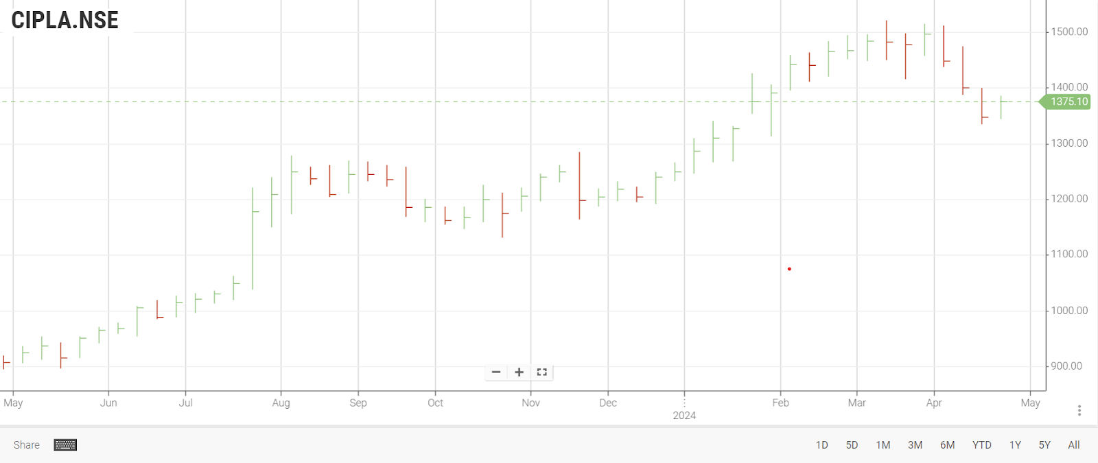
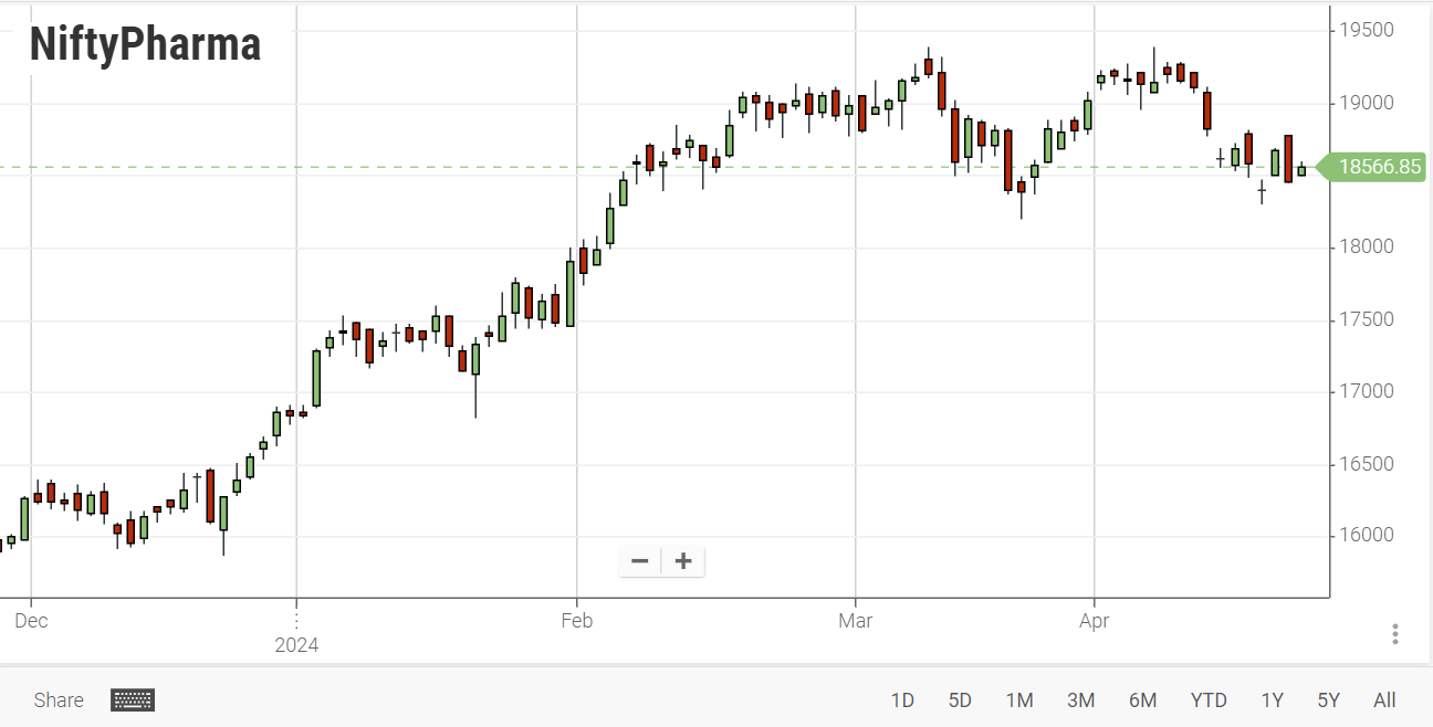
Numerous finance and stock market websites, including the official NSE website, provide real-time updates on market trends through these chart formats. These platforms not only track financial instruments such as securities but also display fluctuations in key indices like the Nifty Index.
Considered an art by market experts at both BSE and NSE, interpreting these charts is essential. Beginners can benefit from learning various strategies to make informed decisions in the market.
Frequently Asked Questions.
-
What do patterns on stock charts signify?
Patterns on stock charts represent distinctive arrangements of price movements, discerned through trendlines and curves. These patterns help traders analyze market trends, differentiating between upward (bullish) and downward (bearish) shifts.
-
How to study a Bank Nifty chart?
Studying a Bank Nifty chart involves several steps. Start by identifying the timeframe you're interested in, whether it's daily, weekly, or intraday. Analyze the chart for trend direction, recognizing patterns and significant price levels. Pay attention to volume fluctuations and relevant technical indicators.
-
What is an OHLC chart, and how is it read?
OHLC (Open, High, Low, Close) charts display opening, highest, lowest, and closing prices for each trading period. The vertical line's length represents the period's price range, while the left and right lines denote opening and closing prices. OHLC charts are valuable for analyzing momentum fluctuations and identifying market trends.
-
How are OHLC charts interpreted for trading decisions?
Traders assess OHLC bars' vertical height to gauge market volatility. Horizontal line positions indicate opening, closing, high, and low prices. Bar colors (black for uptrends and red for downtrends) offer trend direction insights. Traders also look for specific patterns, such as key reversals, to anticipate potential market shifts.
-
What are candlestick charts, and what do they signify?
Similar to OHLC charts, candlestick charts display the opening, highest, lowest, and closing prices for a specific period. The "real body" represents the price range between opening and closing trades. Filled or black real bodies indicate closing prices are lower than opening prices, while white or green bodies suggest higher closing prices.
-
How can I better understand the nuances of a Bank Nifty chart?
To understand a Bank Nifty chart effectively, focus on its components. Learn to interpret candlestick patterns, recognizing bullish and bearish signals. Understand the significance of support and resistance levels specific to banking stocks. Explore various technical indicators tailored for the banking sector, such as Moving Averages, Relative Strength Index (RSI), and Bollinger Bands. Additionally, stay updated on economic indicators and banking-related news, as they influence Bank Nifty movements. Practice and continuous analysis will enhance your understanding of Bank Nifty charts over time.